UX/UI Designer & Brand Strategist
1 Month
Solo
A digital product that maintains a luxury brand feel tailored to special case users.
Project Overview
The Challenge
Design a mobile ordering experience for FO SUSHI (Bettendorf, Iowa) that prioritizes allergen safety and dietary restrictions while maintaining an intuitive, streamlined checkout process.
Target Users
- People with food allergies and dietary restrictions
- Busy professionals seeking quick, safe meal ordering
- Health-conscious diners (vegan, gluten-free, etc.)
- Quad Cities local residents and visitors
Design Principles
Allergen information is prominent, clear, and accessible at every decision point
Streamlined 4-step checkout: Cart → Details → Extras → Complete
Color-coded allergen tags and clear category organization
Last-minute order changes and customizable extras
Design Metrics
Color System
Brand Colors
Primary – Olive/Sage Green
Primary Hover
Allergen Tag Colors
Users & Their Needs
The first step was understanding who would actually rely on FoSushi for their meals. I focused on three core user groups and listened to how delivery, ordering, and trust fit into their daily routines.
The pattern was clear: trust and clarity mattered as much as speed. Users wanted a premium ordering experience that removed uncertainty and let them order confidently without thinking about the interface.
What was everyone else doing wrong?
I conducted a competitive audit of the leading sushi delivery platforms in the Quad Cities, including Kobe Sushi, Red Ginger, and Osaka. I evaluated their user flows through the lens of my core personas, such as the “Busy Professional” and the “Allergy-Sensitive” diner. The architectural friction and branding gaps became obvious immediately:
Menu Paralysis
Competitors buried high-end rolls under generic headers, creating a “choice overload” that slowed down busy professionals.
The Trust Gap
A total lack of visual dietary cues (Cooked, Veggie, Spicy) forced users with restrictions to abandon their carts.
Brand Invisibility
Premium sushi lost its “luxury” feel in low-fidelity interfaces that failed to communicate the $$$ quality of the food.
The Opportunity
What if we brought the exclusive sushi bar experience directly to the office? By architecting a premium digital storefront that prioritizes speed, safety, and “Foo Foo” branding, we can serve the Quad Cities’ elite professionals who refuse to settle for standard takeout.
The Blueprint: Bridging Brand & Architecture.
Application Site Map
The application follows a linear flow with three main pages and a streamlined checkout process in a slide-out drawer to minimize context switching.
Navigation Patterns
Primary Navigation
- Back button (top-left) for page navigation
- Cart icon (top-right) with item count badge
- Floating cart button (mobile, bottom-right)
Secondary Navigation
- Category sidebar for menu filtering
- Expandable allergen filter section
- Linear checkout flow with back buttons
To solve the “menu paralysis” identified in my audit, I architected a user flow that prioritizes discovery and safety. By categorizing the menu into Traditional, Signature, and Dietary Specific paths, I reduced the cognitive load for our busy professionals while ensuring high-stakes information, such as allergen labels and e-gift forms, remained only one tap away. Less is more in most cases like these.
Primary User Flow
From landing to order completion – optimized for users with dietary restrictions.
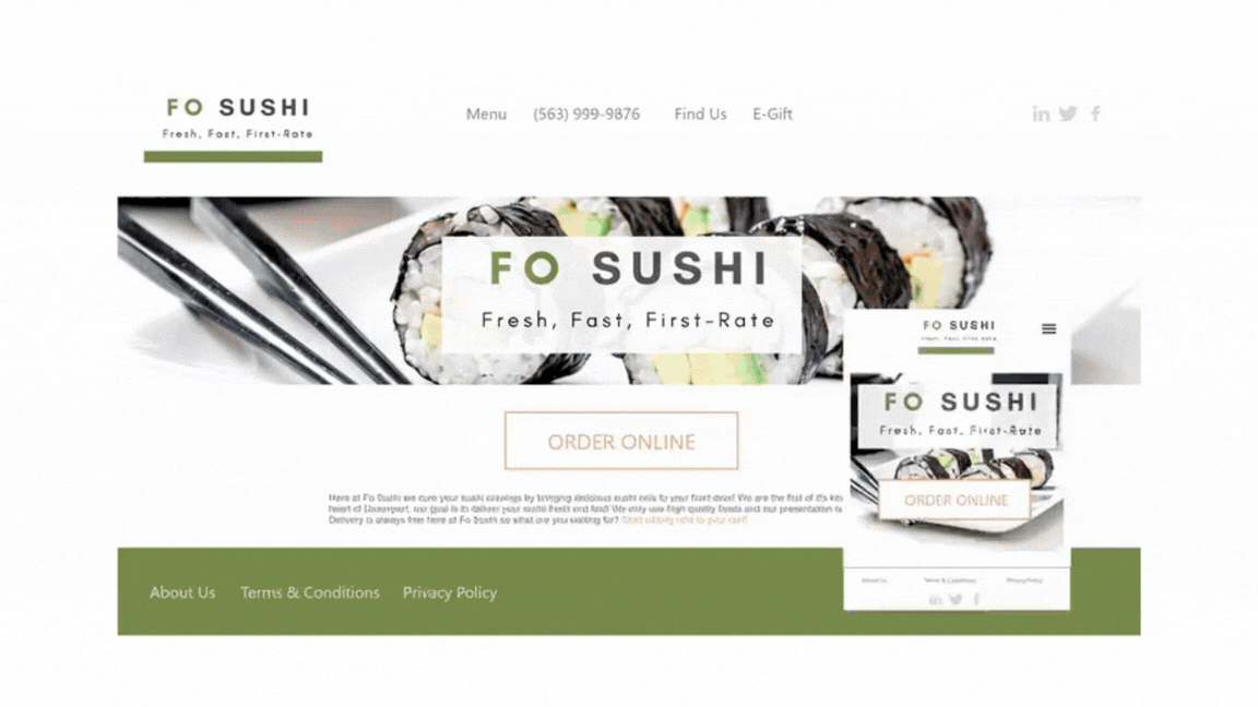
Landing Page Entry
User arrives at landing page, reads about allergy-friendly ordering features.
- Location: Bettendorf, Iowa (Quad Cities)
- 8 tracked allergens displayed
- Clear CTA: “Order Online”
Browse Menu with Filters
User selects dietary preferences and browses safe menu options.
- All Items / Traditional / Specialty
- Allergen filters (GF, NF, SF, Vegan)
- Color-coded allergen tags
- Items matching ALL selected filters
Add to Cart
User adds items with one-click, cart drawer opens automatically.
- Instant slide-out drawer preview
- Quantity adjustment without leaving page
- Gift certificate code entry
Enter Delivery Details
Minimal form with only essential information.
- Full Name & Phone Number
- Delivery Address (Quad Cities area)
- Special Instructions (optional)
Customize Extras
Select complimentary condiments and utensils.
- Soy Sauce, Wasabi, Ginger
- Chopsticks & Napkins
Order Confirmation & Tracking
Real-time order status with delivery map and last-minute edit option.
- Preparing / Ready / Out for delivery
- Interactive map location
- “Make Last-Minute Changes” button
Alternative User Flows
Empty Cart Flow
User opens cart without items; shown empty state icon and CTA to browse.
Order Editing Flow
User modifies order after placement; shown delay warnings before saving changes.
Clear UI states and visual feedback reduce hesitation, enabling older users to tune confidently on their instruments.
Key Features & Innovations
1. Allergen-First Design
Unlike traditional food ordering apps, allergen information is not hidden in item details – it’s front and center on every menu item with color-coded visual tags.
Traditional Approach
- • Allergen info buried in item details
- • Requires multiple clicks to view
- • No visual indicators on menu
- • Generic filtering
FO SUSHI Approach
- ✓ Color-coded tags on every item
- ✓ Instant visual recognition
- ✓ Filter by multiple allergens
- ✓ Shows only items matching ALL filters
2. Streamlined 4-Step Checkout
Reduced friction by consolidating checkout into a slide-out drawer with minimal required fields.
Design Decisions:
- ✓ Non-blocking drawer: Users can close and return to menu without losing cart
- ✓ Inline cart editing: Adjust quantities without leaving checkout flow
- ✓ Gift code integration: Applied in cart view before proceeding to payment
- ✓ Extras step: Prevents forgotten condiments while keeping them optional
3. Post-Order Flexibility
Recognizing that users may need to make changes, the app allows last-minute order modifications with transparent communication about potential impacts.
Live Tracking
Visual timeline with status updatesOrder Editing
Modify items after placementDelivery Map
Embedded Quad Cities map4. Smart Category + Allergen Filtering
Dual-layer filtering system allows users to narrow down by food category AND dietary needs simultaneously.
Filter Logic:
Example 1: “Traditional Rolls” + “Gluten-Free”
Shows only traditional rolls that are gluten-free (intersection, not union)Example 2: “All Items” + “Nut-Free” + “Soy-Free”
Shows items that are BOTH nut-free AND soy-free (strict filtering for safety)5. Contextual Information Display
Information is revealed progressively based on user actions to avoid overwhelming the interface.
Landing: High-level allergy safety overview
Menu: Per-item allergen tags with expandable filters
Cart: Subtotal breakdown with gift code discount shown separately
Tracking: Full order details with map and timeline
Accessibility & Usability
Visual Accessibility
- ✓ Color + text labels for colorblind users
- ✓ High contrast allergen tags with borders
- ✓ Large touch targets (44px minimum)
- ✓ Clear visual hierarchy with headings
Interaction Design
- ✓ One-click add to cart (no confirmation modal)
- ✓ Inline quantity adjustment with +/- buttons
- ✓ Persistent cart badge shows item count
- ✓ Back navigation always available
Mobile-First Optimization
Designed primarily for mobile ordering with responsive desktop support.
Thumb-Friendly
Cart and back buttons positioned for easy one-handed use
Floating Cart
Bottom-right FAB shows cart summary on mobile
Scrollable Sections
Long lists (menu, cart) scroll independently
What I Learned
Trust is Built Through Transparency, Not Just Design:
For a premium food brand, “high-end” isn’t just looks—it’s a feeling of being in safe hands. By making allergen data a core part of the UI rather than an afterthought, I learned how to use design to build the deep level of trust required to sell fresh, raw sushi online.
Information Hierarchy is the Key to Inclusivity
I realized that a truly “user-centric” experience means designing for the most vulnerable diner. I learned how to balance a clean, minimalist layout with the high density of information needed for allergen filters, ensuring that the interface stays sophisticated while remaining fully accessible to people with strict dietary needs.
Translating the Gap from Physical to Digital
I learned how to take the attentive, personalized care of a premium in-person dining experience and translate it into a digital experience. This project taught me that branded storytelling and a confident, responsive layout can close the gap between a physical storefront and a delivery app, making the digital journey feel just as intentional as a seat at the sushi bar.