Lead UX Designer
8 Months
8 People
secured0K investment
Challenge
Shoppers can’t see how a shade will look on their nails before buying. This creates hesitation and lost sales.
Solution
Hue Beauty Booth uses AR to let customers scan, snap, and instantly try on colors. No guesswork, just confident purchases.
Impact
The prototype secured $50K in funding. This investment is now fueling full app development and in-store launch.
- Design Process
- Research
- Strategy
- Branding
- Testing
Research & Discovery
Activities
- User interviews
- Competitive analysis
- Analytics review
- Stakeholder workshops
Deliverables
- Research report
- User personas
- Journey maps
- Problem statement

Ideation & Strategy
Activities
- Design principles definition
- Information architecture
- User flow mapping
- Concept sketching
Deliverables
- IA diagrams
- User flows
- Design principles
- Concept sketches
Design & Prototyping
Activities
- Wireframing
- Visual design
- Interactive prototyping
- Design system creation
Deliverables
- Wireframes
- High-fidelity mockups
- Interactive prototype
- Design system
Testing & Iteration
Activities
- Usability testing
- Accessibility testing
- Stakeholder feedback
- Design refinement
Deliverables
- Test reports
- Refined designs
- Handoff documentation
- Implementation guide
Competitive Analysis & Market Gap Identification
To develop an AR beauty app that would truly revolutionize the cosmetics industry, I conducted extensive competitive analysis by exploring and testing existing applications with similar functionalities. This hands-on approach allowed me to identify critical gaps in the market while documenting what worked well and what didn’t in current solutions.
Research Methods
Competitive Analysis & Discovery
8 leading beauty AR apps
Explored existing beauty applications to identify market gaps and user experience patterns. Found that most apps were overly complex with poor navigation and limited vendor integration capabilities.
User Interviews
12 beauty industry participants
Spoke with executives, salon owners, and beauty enthusiasts to understand their frustrations with current color-shopping experiences. Everyone expressed desire for “try before you buy” solutions.
User Testing
10 Participants
Created paper-based card prototypes to test core user flows. Users struggled with navigation complexity and wanted a more streamlined color selection process. Modified until interactions felt natural and intuitive.
Market Research
6 months industry analysis
Discovered that color mismatches drive 25-40% return rates for beauty products, creating significant pain for both customers and vendors.
User Personas
Jessica Holt
The Busy Professional
Age: 32
Salon & Spa Owner
Cleveland, OH
Primary Goal
Enhance customer’s experience while minimizing product waste and losses from returns.
Main Pain Point
Managing inventory losses and disappointed customers when colors don’t match their expectations.
Quote
“Returns are frustrating for everyone, we lose money and customers lose trust in our recommendations.”
Motivations
- Build client loyalty
- Reduce operational costs
- Stay competitive
- Modern appearance
Erica Parker
The Creative Student
Age: 19
Beauty Enthusiast/Digital Creator
Cleveland, OH
Primary Goal
Create a bold, sustainable, and influential beauty brand that inspires and connects with others.
Main Pain Point
Wants to experiment with bold beauty looks and grow her influencer brand, but as a student on a budget, it’s difficult to afford quality products, learn professional techniques, and stay eco-friendly.
Quote
“I want to experiment with bold beauty looks and grow my brand, but it’s hard to find affordable, sustainable products that fit into my student budget.”
Motivations
- Connect with like-minded beauty enthusiasts
- Use sustainable products
- Build personal brand
- Learn professional makeup skills
- Express creativity
Mark Thompson
The Innovative Marketer
Age: 43
Vice President of Marketing
Cleveland, OH
Primary Goal
Drive innovative marketing strategies to differentiate his brand, grow market share, and establish himself as a thought leader in the beauty industry.
Main Pain Point
Struggles to find creative ideas that balance innovation with practicality while keeping up with the fast-paced beauty industry and managing diverse teams and stakeholders.
Quote
“I want our brand to stand out and lead the market, but it’s a challenge to keep ideas fresh, feasible, and aligned with everyone’s expectations.”
Motivations
- Innovate marketing campaigns
- Stay ahead of industry trends
- Enhance brand differentiation
- Achieve business objectives
- Lead and inspire teams
User Journey Map(created for all user types, only 1 shared here)
Strategy: Building Confidence Through Simplicity
The strategy began with understanding the core friction in beauty retail: the gap between shelf appeal and real-world results. Through competitive analysis and user pain point mapping, we identified that uncertainty about color accuracy on different skin tones drives purchase hesitation. This insight shaped our entire approach.
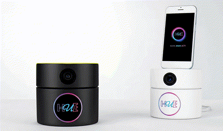
Strategic Architecture: Scan. Snap. Act!
A core strategic decision was simplifying the user journey into three intuitive steps, a framework that would differentiate Hue from overly complex competitor solutions. This architecture wasn’t just about UX, it was a strategic positioning move. By reducing friction to three verbs, we created a memorable, teachable experience that works equally well for first-time users and retail staff demonstrations.
Scan
Use AR to capture the product barcode or color
Snap
Instantly visualize the shade on your own skin tone in real-time
Act
Make a confident purchase decision or save favorites for later
Key Strategic Pillars
1. Simplicity as Competitive Advantage
While competitors added features, we subtracted complexity. The three step flow became our north star for all design and development decisions.
2. Technology First Solution
Leverage AR technology to eliminate the guesswork that plagues traditional beauty shopping, positioning Hue as an innovation leader in the beauty tech space.
3. User Confidence as Currency
Build the product around reducing purchase anxiety rather than just adding features. Every design decision was evaluated against: “Does this make the customer more confident?”
4. Retail Partnership Model
Design for dual contexts, personal mobile use and in-store beauty booth experiences to create multiple revenue streams and brand touchpoints.
Go to Market Approach
The strategy prioritized a proof-of-concept that could secure investment funding before full development. By focusing on a high-fidelity prototype that demonstrated the Scan-Snap-Act flow in action, we positioned Hue to attract early-stage funding and retail partnerships simultaneously.
Design Impact
The prototype’s strategic clarity and user experience design proved compelling enough to secure $50K in seed funding. This investment validated the design direction and enabled the transition from concept to full development. The handoff included comprehensive design specifications, interaction flows, and brand guidelines to ensure seamless implementation.
Differentiation
While competitors offered static color swatches or limited AR experiences, Hue’s strategy centered on creating the most accurate, personalized color matching experience, one that works seamlessly across mobile and physical retail environments, all through an elegantly simple three-step process.
Branding & Visual Identity
As we progressed with the project, we recognized the importance of establishing a strong brand identity for our product. Before diving into the full prototype development, we dedicated time to the branding phase. Drawing inspiration from various sources, we employed a combination of hand-drawn elements and curated Pinterest boards to explore diverse color combinations. To capture the essence of our desired brand image, we meticulously curated a mood board that served as a source of inspiration throughout the design process.
In shaping our brand, we drew inspiration from renowned brands that resonated with us personally. Notably, Apple’s design philosophy and their utilization of both light and dark interfaces influenced our decision to offer a similar option within our app. By embracing the versatility of light and dark color schemes, we aimed to cater to different user preferences and create a visually appealing and accessible user experience.
Brand Identity Exploration
Word Cloud Methodology
At the heart of our naming and identity process was the creation of a comprehensive word cloud (a visual brainstorming tool that helped us distill the essence of the brand into key concepts and associations). This exercise proved invaluable in identifying the core language that would resonate with our target audience.
1. Keyword Generation
We began by conducting brainstorming sessions with stakeholders, potential users, and team members to generate a comprehensive list of words associated with the app’s functionality, benefits, and emotional appeal. Terms like “photo,” “AR,” “booth,” “beauty,” “colorful,” and “try it” emerged as central themes.
2. Thematic Categorization
We organized the words into thematic clusters—technology terms (AR, cloud, click it), user actions (snap, view, try it), product categories (cosmetics, nails, beauty), and brand attributes (fun, exciting, vibrant, shiny, colorful). This helped us understand the different facets of the brand identity.
3. Visual Weighting & Color Coding
Using specialized word cloud software, we weighted terms based on their importance and frequency in user research. More critical concepts appeared larger in the visualization. We applied our brand color palette—vibrant pinks, purples, greens, and blacks—to different word categories, creating a visual hierarchy that reflected our design direction.
4. Name Selection & Validation
The word cloud revealed “HUE” as a standout option for us. It was short, memorable, directly related to color (the app’s core value proposition), and easy to pronounce. It appeared prominently in multiple variations, reinforcing its significance. We validated this choice through focus groups and market research, confirming it resonated with both vendors and consumers.
Word cloud analysis revealing “HUE” as the optimal brand name
Brand Strategy
Brand Personality
- Revolutionary & Innovative
- Immersive & Interactive
- Confident & Empowering
- Modern & Trend-Forward
- Risk-Free & Trustworthy
Target Audience
- Beauty Industry Executives (30-55)
- Salon & Spa Owners (39-55)
- Beauty-conscious consumers
- Innovation-seeking professionals
- AR technology enthusiasts
Brand Values
- Customer satisfaction & confidence
- Innovation through AR technology
- Reducing waste & returns
- Seamless user experience
- Building trust & loyalty
Brand Promise
HUE Beauty Booth revolutionizes the way consumers engage with beauty products, offering an augmented reality experience that eliminates color mis-matches and buyer’s remorse. By empowering users to visualize colors on their own skin before purchase, we create confident, informed decisions that benefit both vendors and consumers.
Logo Concept Exploration
During the design phase, we explored several logo directions to find the perfect visual representation of the HUE brand. Each concept was evaluated based on memorability, scalability, and alignment with our brand values.
Concept A: Solid Form
Bold color swatches with strong visual impact. This concept emphasizes confidence and makes a statement, but risked feeling less playful.
Concept B: Gradient Border
Bold gradient frame with bolder interior. This version balanced fun and playful with technology, though the font felt less memorable.
Concept C: Final Selection
Vibrant gradient ring with optimal color transitions. This design perfectly captured the brand’s energy and positioned HUE as innovative and approachable.
Logo Design & Identity
Design Rationale
The HUE logo embodies the dynamic energy of color discovery through augmented reality. The circular gradient border symbolizes the continuous spectrum of hues available to users, while the bold letterforms convey confidence and innovation. Each design element was carefully crafted to reflect the brand’s mission of transforming the beauty shopping experience.
Typography: Ubuntu Bold
The Ubuntu Bold typeface was selected for its perfect balance of friendliness and technical precision. Its geometric construction echoes the AR technology at the app’s core, while maintaining approachability. The custom treatment of the letterforms that are outlined with a distinctive cursive ‘u’ in cyan creates a memorable visual signature that stands out in the competitive beauty tech space.
Circular Gradient Frame
The gradient circle represents the infinite possibilities of color exploration. Flowing from purple to pink, it mirrors the beauty spectrum and creates a sense of motion and transformation perfectly capturing the AR “try-on” experience. The circle also suggests completeness and trust, essential qualities for confident purchase decisions.
Tagline: “Scan, Snap, Act!”
The three-word tagline distills the user journey into actionable steps. Each word is color coded, reinforcing the brand’s vibrant personality and creating rhythm that mirrors the quick, seamless experience of using the app.
Final brand system
Color Palette
Purple Gradient
#B794F6 → #EC4899
Cyan
#4FC9EE
Pink
#EC4899
Black
#000000
White
#FFFFFF
The vibrant gradient from purple to pink creates energy and excitement, while cyan adds a fresh, modern touch. The bold contrast between black and white ensures versatility across both light and dark interfaces.
Color Psychology & Symbolism
Purple conveys creativity and luxury, pink adds warmth and approachability, while cyan represents innovation and clarity. Together, these vibrant hues communicate the app’s dual purpose: empowering consumers with cutting-edge technology while maintaining the joy and excitement of beauty discovery.
Typography
Ubuntu Bold
Headings & Display Text
Designed to stand out while maintaining the font’s distinctive modern, humanist style, creating memorable first impressions.
Inter
Body Text & UI Elements
Clean, readable sans-serif optimized for digital interfaces and accessibility.
Brand Applications
The HUE brand identity was adapted across multiple touchpoints to ensure consistency and recognition across all digital platforms. Each application was carefully optimized for its specific context while maintaining the core brand essence.
Business Card
The business card for HUE balances brand expression, readability, and memorable tactile experience, guiding the user naturally through the information while leaving a strong impression of the brand’s personality.
Mobile App Icon
The app icon translates the HUE identity into a compact, recognizable format optimized for iOS and Android platforms. The rounded square format with gradient background creates immediate visual impact on device screens, while maintaining legibility at all sizes from 1024×1024px down to 29×29px.
- Optimized for iOS and Android guidelines
- Maintains brand recognition at small sizes
- Stands out in crowded app store listings
Social Media Profile Image
The circular profile image format leverages the logo’s natural geometry, creating a cohesive presence across Instagram, Facebook, Twitter, and LinkedIn. The vibrant gradient ring creates visual pop against both light and dark platform themes.
- Circular format optimized for all platforms
- High contrast for profile picture visibility
- Consistent brand presence across channels
Social Media Cover/Banner
Testing & Validation
Since HUE Beauty Booth is a new build and not yet a live product, our testing phase followed a two-stage approach: starting with rapid, low-fidelity exploration for ideation and team alignment, then advancing to high-fidelity prototyping for detailed validation and developer handoff.
Our Testing Process
Card Deck / Paper Sketches
Purpose: Low-fidelity exploration and ideation
- Fast brainstorming and concept testing
- Team alignment on core flows
- Quick iteration without digital overhead
- Identifying major UX issues early
XD Prototype
Purpose: High-fidelity testing and developer handoff
- Detailed interaction and animation testing
- Precise user flow validation
- Visual design refinement
- Developer-ready specifications
Stage 1: Card Deck Prototype Testing
Low-fidelity exploration phase for rapid ideation and team alignment
Methodology
We developed a simple paper-based card-style prototype to simulate the app’s core functionality. This low-fidelity approach allowed us to rapidly test interaction flows and gather feedback without the overhead of digital prototypes.
- Physical Card Interactions
Users moved through screens represented by cards, simulating app navigation
- Real-time Note Taking
Team documented user reactions, hesitations, and suggestions during sessions
- Iterative Refinement
Issues identified were immediately addressed in subsequent testing rounds
Key Findings & Iterations
Barcode Scanning Flow Confusion
Users weren’t sure when to scan the barcode vs. when to take the photo
Added clear visual prompts and step indicators to guide users through the scan-snap-act sequence
AR Preview Expectations
Users expected instant preview without understanding the AR processing step
Introduced loading animation with educational messaging about AR color mapping
Save & Share Functionality
Users wanted to save multiple tries and compare different colors
Added “Try History” feature and side-by-side comparison view
Testing Participants
Stage 2: XD Interactive Prototype Testing
High-fidelity validation phase for detailed testing and developer handoff
95%
Task Completion Rate
Users successfully completed barcode scan to AR preview flow
4.7/5
User Satisfaction
Average rating across all prototype interactions
3
Major Iterations
Rounds of refinement based on feedback
Testing Scenarios
First-Time User Onboarding
Task:
Navigate through initial app tutorial and complete first color try-on
Result:
88% completed without assistance
Insight:
Added a skip option for experienced users and logged-in users, although most appreciated the educational approach. The prototype featured here reflects the post “Skip/logged-in” version, where users can bypass registration and proceed directly into the scan-snap-act experience.
Barcode Scanning & AR Preview
Task:
Scan product barcode, capture hand/face photo, view AR color application
Result:
95% successful on first attempt
Insight:
Clear visual indicators made the flow intuitive despite AR complexity
Comparing Multiple Colors
Task:
Try on 3 different lipstick shades and use comparison feature
Result:
92% found and used comparison view
Insight:
Users wanted to save comparisons for later reference while shopping
Sharing Results
Task:
Save AR preview and share to social media or with friends
Result:
78% completed sharing task
Insight:
Made share button more prominent and added direct messaging options
Team Feedback Sessions
Weekly internal design reviews with cross-functional team members to evaluate prototype iterations
UX Design Team
Focused on interaction flows, accessibility, and visual hierarchy
Development Team
Validated technical feasibility of AR features and scanning mechanisms
Product Strategy
Ensured alignment with business goals and market positioning
Beauty Industry Consultants
Provided insights on in-store booth integration and vendor needs
Prototype Evolution
Basic flow with scan → photo → preview
Added comparison feature and improved AR loading states
Integrated sharing, history, and booth-specific interface mode
Key Testing Insights
What Worked Well
- The “Scan, Snap, Act!” tagline effectively communicated the three-step process
- AR color accuracy exceeded user expectations for realism
- Both light and dark mode options were appreciated by different user groups
- Booth concept resonated strongly with retail stakeholders
Areas for Future Improvement
- Explore facial cosmetics AR features (currently under construction)
- Develop administration dashboard for vendor management
- Add more social sharing integrations based on platform preferences
- Consider offline mode for booth deployments with limited connectivity